| Dates: | Nov 2014 |
| Skills/Subjects: | Axure, interaction design, prototyping |
| URL: | http://r4hpk7.axshare.com/ |
Concept
Commute Community opens a new channel for commuters to entertain themselves within an acceptable margin of safety: an ad-hoc voice chat service with others within their vicinity. Technically, it is a mobile app that manages a Bluetooth mesh network of nearby commuters on the road and a single secure voice chat service between them. That way, each user would act as a relay to other users, expanding the range of just one transmitter.
Commute Community could stave off the inevitable boredom that comes with urban traffic jams, long-haul commutes, and professional drivers who are on the same route all day. These users would be encouraged by the proximal nature of the network to stay within range of each other, which may result in more defensive driving habits and staying closer to the speed limit.
Walkthrough
Before the user starts to use Commute Community, he must have both a speaker and microphone for the device. It would be important for the user to either wear a microphone or keep the phone in a good position to catch spoken commands, such as on the dashboard, near the gear shift, or on a console mount. This is both for clarity of the driver’s voice to others, as well as to help reduce proximal noise from the car and passengers; a worn microphone would be the best choice for these reasons.
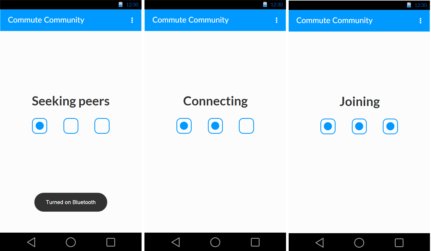
Once the user has started the app, preferably via voice command (e.g. on Android: “ok google, open commute community”) for safety if he’s already driving, it goes into its initial state of seeking other users and turning on Bluetooth in case it is off, establishing a connection, and then joining each others’ connections into a single network.
The app would announce these connection steps via audio to provide ample feedback to a driving user that should be focused on the road rather than his phone. In case it takes some time to find peers, the app would repeat these announcements on an interval (perhaps once per three minutes, configurable by the user) so that user may not think the app has closed. These three connection steps only appear when the user is not connected to any other peers.
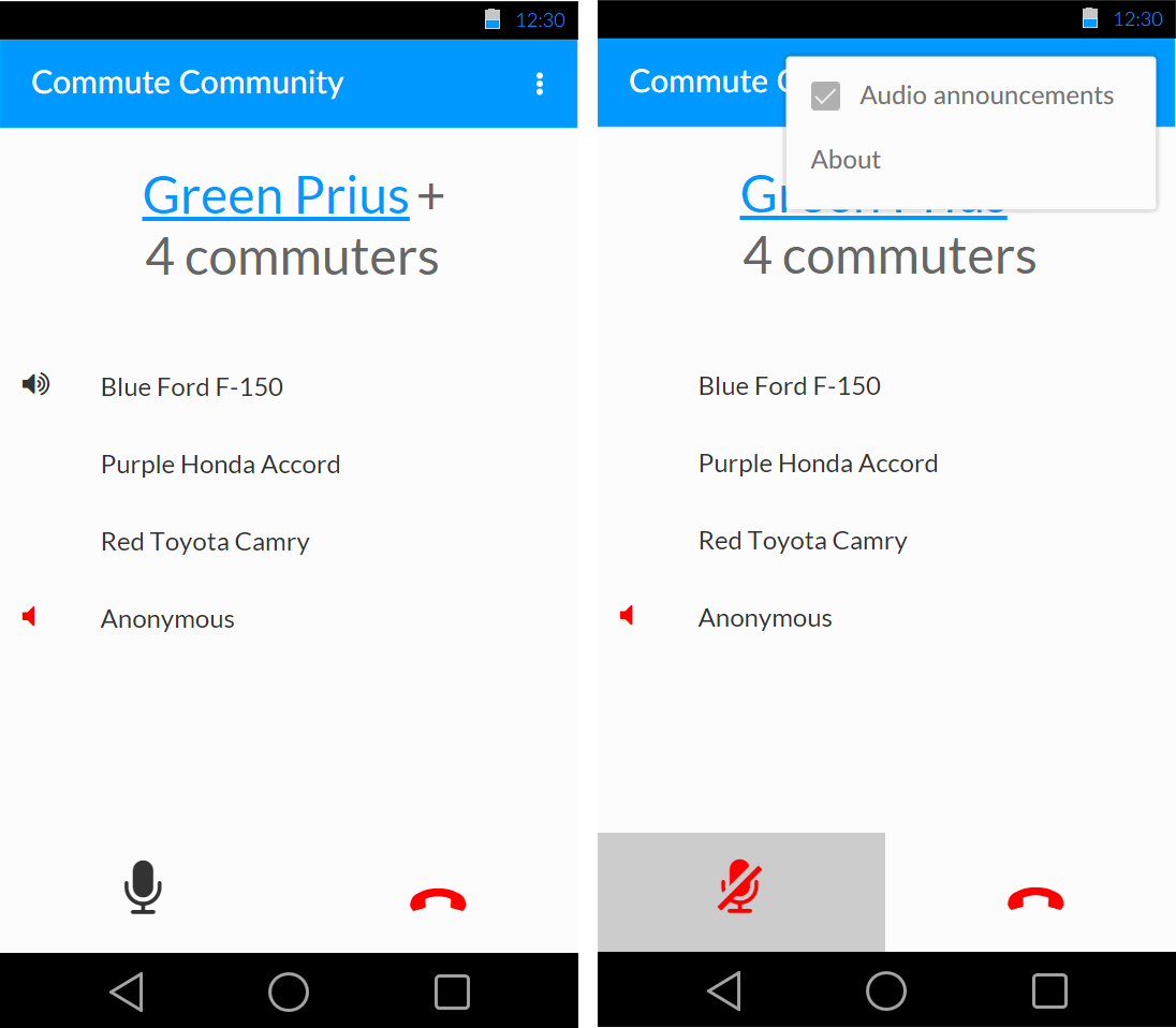
Once the user is connected to peers, new ones would show up in a list and be announced by the app via audio that they have joined the conversation. These announcements may be turned off in the options menu. Now, all users can freely chat with each other. When a user speaks, a speaker with sound waves icon appears next to their name. Should the user want to interact with the app hands-free, it would be best if his peers did not hear all those commands. While the user is in a conversation and says “mute,” the word “mute” will be the last thing other users hear, indicating more naturally that user’s microphone and speakers are now muted.
When the user has muted the app, he then has control over the interface via voice, able to command things like “change car name” or “turn off audio announcements.” To return to the conversation, the user can say “un-mute.” The mute button is in the bottom-left corner, displayed with a microphone icon that turns red and is crossed out with a grey background when activated. Muted users also appear in the list as red speaker icons. The button in the bottom-right corner disconnects the user, or “hangs up,” from the conversation and closes the app.
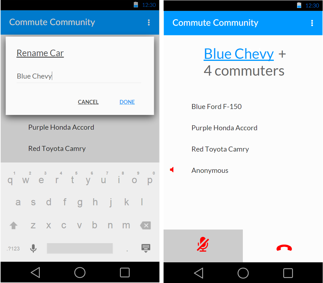
Since many people drive multiple vehicles, it would be necessary for the user to change their car’s name as it is visible to others. To do that, the user would tap the underlined car name (or say “change car name” when muted), and update the name in the dialog. For the sake of identification on the road, the app suggests users to name themselves after the color and make of their vehicle. However, the field is free response, inviting all kinds of input. The default name would be “Anonymous” to allow for instant use without needing to identify oneself. An alternative approach would be to forgo names altogether and use an image of the car instead. This would invite similar alternative inputs, and it would be less available to automatic voice description than a text description. Finally, with in-car heads-up displays like Navdy, there could be augmented reality markers over cars ahead and arrows pointing to cars behind that are speaking at any time.
Design Environment
My primary design choice was to get acquainted with Google’s Material Design style released for the latest Android version as well as other web app redesigns. Initially, I intended to also use their Polymer web prototyping library, built on the new Web Components architecture. However, it is still in developer preview, and I found that it is very difficult and rather convoluted to translate designs from just visual (in my case Balsamiq) to interactive. Their WYSIWYG tool, Polymer Designer, is even more so. Due to these limitations, I decided to forgo their tools and opt instead for Axure, a rapid prototyping tool that I’ve found many designers have come to consider a standby for everything from high-quality comps to shareable interactive prototypes. I had used Axure once before for simply laying out a website. For this project, I wanted to take full advantage of Axure’s strengths to see how closely I could follow my interactivity plans, as well as how easily it could be done. The Axure community is quite active, and many people have created importable libraries based on particular design schemes, including Material Design. The library I found allowed me to quickly import individual elements specified in Google’s style guide and accomplish my primary design choice.
Prototyping
Using Axure, the prototype could be designed in chunks, allowing me to transform certain parts of the design into an interactive, animated elements. Elements like checkboxes, text inputs, buttons, and transitions were all made possible via this feature of the program. For example, I animated the initial connection sequence to communicate it better than the static screens I previously mocked up in Balsamiq. I was also able to put certain functions in the collapsible menu button in the top-left corner, as well as a simple screen transition for the app’s information. Some functions like actual voice control and closing the app via the disconnect button are of course only possible in the fully functional product, so they would be evaluated via Wizard-of-Oz means in a real usability evaluation.
Some functions, like timed animations, are still not quite clear to me, so where they are present they are not exactly as I had envisioned them. For example, the blinking speaker icon next to “Blue Ford F-150” would be better accompanied by a sound clip of someone speaking. Also, the “audio announcement” feature, when turned on, would be best communicated if the prototype’s user would actually hear those announcements. In a usability test scenario with the prototype in this condition, that would be a researcher pretending to be the system again in a Wizard-of-Oz manner. Unfortunately, the Material Design library I imported did not appear to include the animations espoused by the style guide. I did what I could though to show the animations most important to the flow of the app so that it didn’t appear jarring (e.g. a menu immediately popping in and out versus the animated slide).
Further Work
The Commute Community concept is targeted toward drivers, however it could also be applied to stationary users. An actual walled room may naturally bound wireless signals and thus the chat service, creating a literal chat room. In this way, the app could be extended to include text and video chatting, which would be too dangerous for vehicle settings and thus not implemented in this iteration. A mesh network for this kind of chatting is well exemplified by the FireChat app.
The choice of networking protocol is also an interesting subject. I chose Bluetooth for its low energy draw and fairly flexible, usable user interface. There also existed several Bluetooth mesh network implementations that I would have investigated further if time permitted. WiFi, though, was the first alternative I considered, since it would have a greater range than Bluetooth and be more configurable. However, it has higher power draw and prevents the user from using other WiFi networks while it broadcasts its own.


