| Client: | Truss, Department of Labor |
| Dates: | July 2021 – 2023 |
| Skills/Subjects: | civic media, interaction design, prototyping, research, UI design, usability |
| URL: | https://www.dol.gov/agencies/eta/ui-modernization |
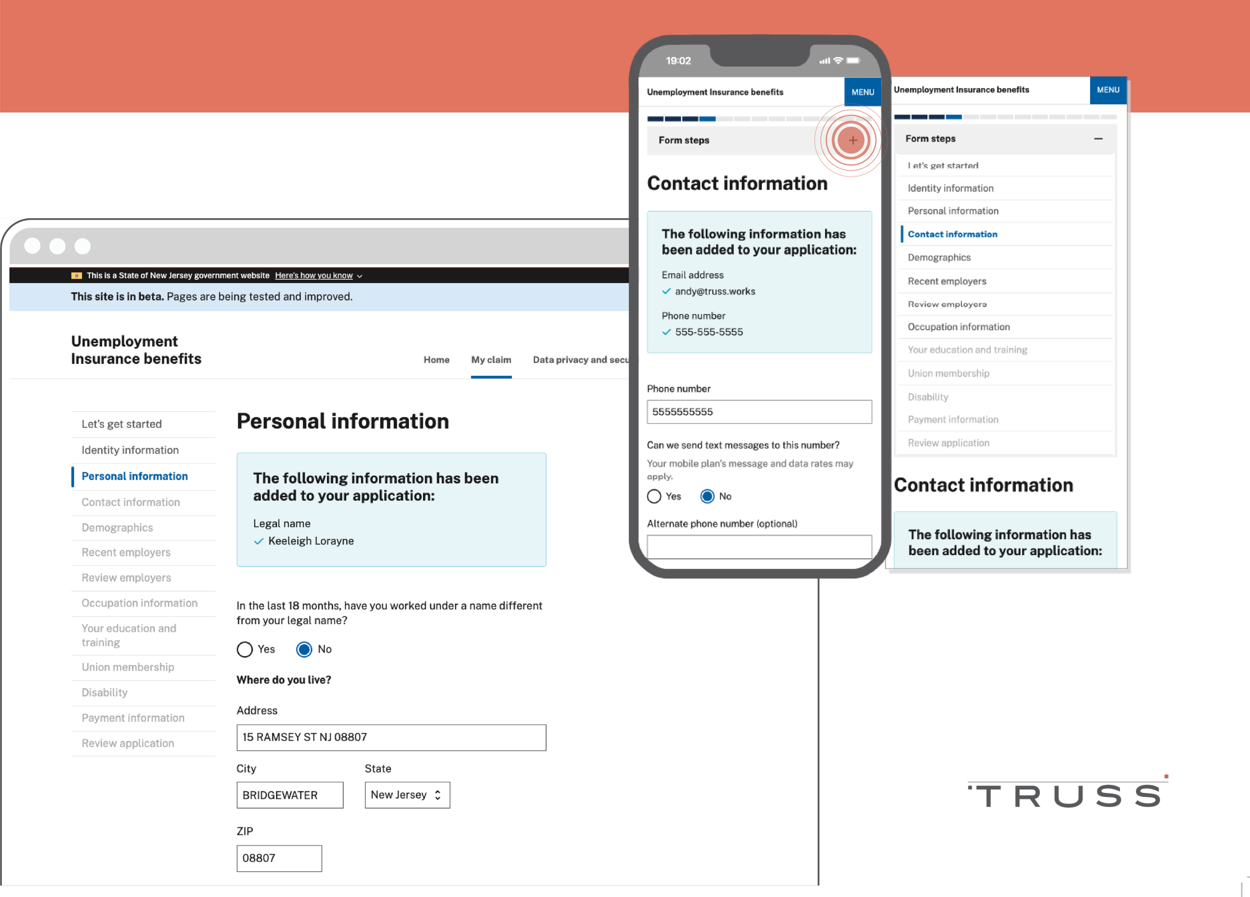
I led design and research for Truss with the Department of Labor to deliver a $4M pilot project to transform the unemployment insurance (UI) experience for all states. Our work led to a 48-minute reduction in the time to apply for benefits (and probably helped NJ’s DOL commissioner keep his job).
I also conducted design and accessibility reviews of our engineering work, and I contributed a fair amount of front end engineering work myself. You can find a huge amount of our design/UX capacity-building work is reflected in this DOL website, and our coded work is on Github in the federal DOL and New Jersey’s DOL‘s organizations.
Our work
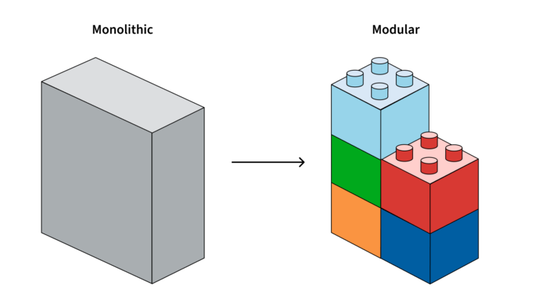
We began our work with our discovery and framing process, partnered with the U.S. Digital Service. Following a survey of interested states’ unemployment and technical teams, we conducted group interviews with state stakeholders to build a report and service blueprints.
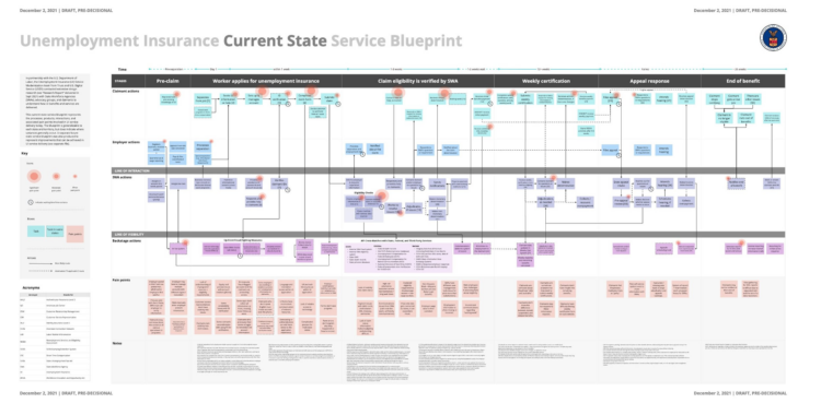
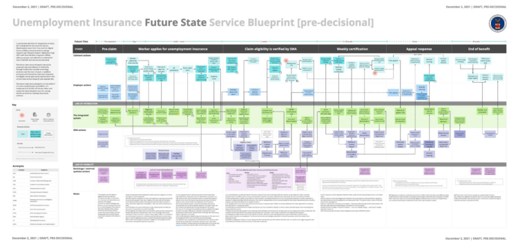
We shared these with the Executive Branch and Congress to describe the landscape of UI modernization and capacity for change across states and territories in order to set our strategy and roadmap. This allowed us to triangulate and more clearly bound the problems to be solved in our work period, while also providing nuance and stories from different perspectives in both qualitative and quantitative terms. Using this data, we transitioned to continuous delivery, involving rapid research-design-engineering iterations to test our understanding and progress to our goals.
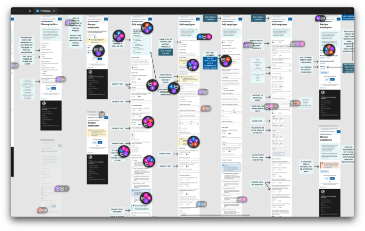
We continued engaging our state partners through expert interviews, and they connected us to community partners and regular claimants to bring into our research and design practice. We conducted usability tests and concept tests with those claimants and partners to rapidly iterate on our Figma prototype, which in turn provided ample artifacts for demos and vetting sessions with our state and federal stakeholders. Finally, by the end of our work period, we turned over our research corpus (in Dovetail) to the state team to continue working and provided a very well received prospectus on how to continue the work. Our contract officer expressed enthusiasm for the UX report, describing it as the new de facto standard for how DOL will approach UI modernization going forward.
I have published a full account of our work—including that UX report—in a series of posts on Truss’ blog:
- Modernizing unemployment insurance
- Continuous development and decision records
- Feedback loops and refinements
- Return on investment for users
- Detailed UX metrics
Since then…
Rutgers University published a paper describing our combined work of overhauling New Jersey’s unemployment experience, specifically calling out our collaboration and feedback loops as highly effective and motivating, as well as praising our plain language improvements.
We enjoyed similar feedback and approbation—with extra emphasis on my articles linked above—from many states’ DOLs and others at that year’s NASWA conference.
I presented our work to date to the Beeck Center for Social Impact and Innovation at Georgetown University, which led to us joining the UI Tech Coordinating Coalition for their Digital Benefits Network. I continued as the company’s representative on this coalition until I departed Truss.
I’ve continued collaborating with the US Digital Response on various matters, like plain language with Marcie Chin.
