| Client: | Truss, IRS |
| Dates: | July 2023 – Present |
| Skills/Subjects: | accessibility, civic media, interaction design, prototyping, research, UI design, usability |
| URL: | https://directfile.irs.gov/ |
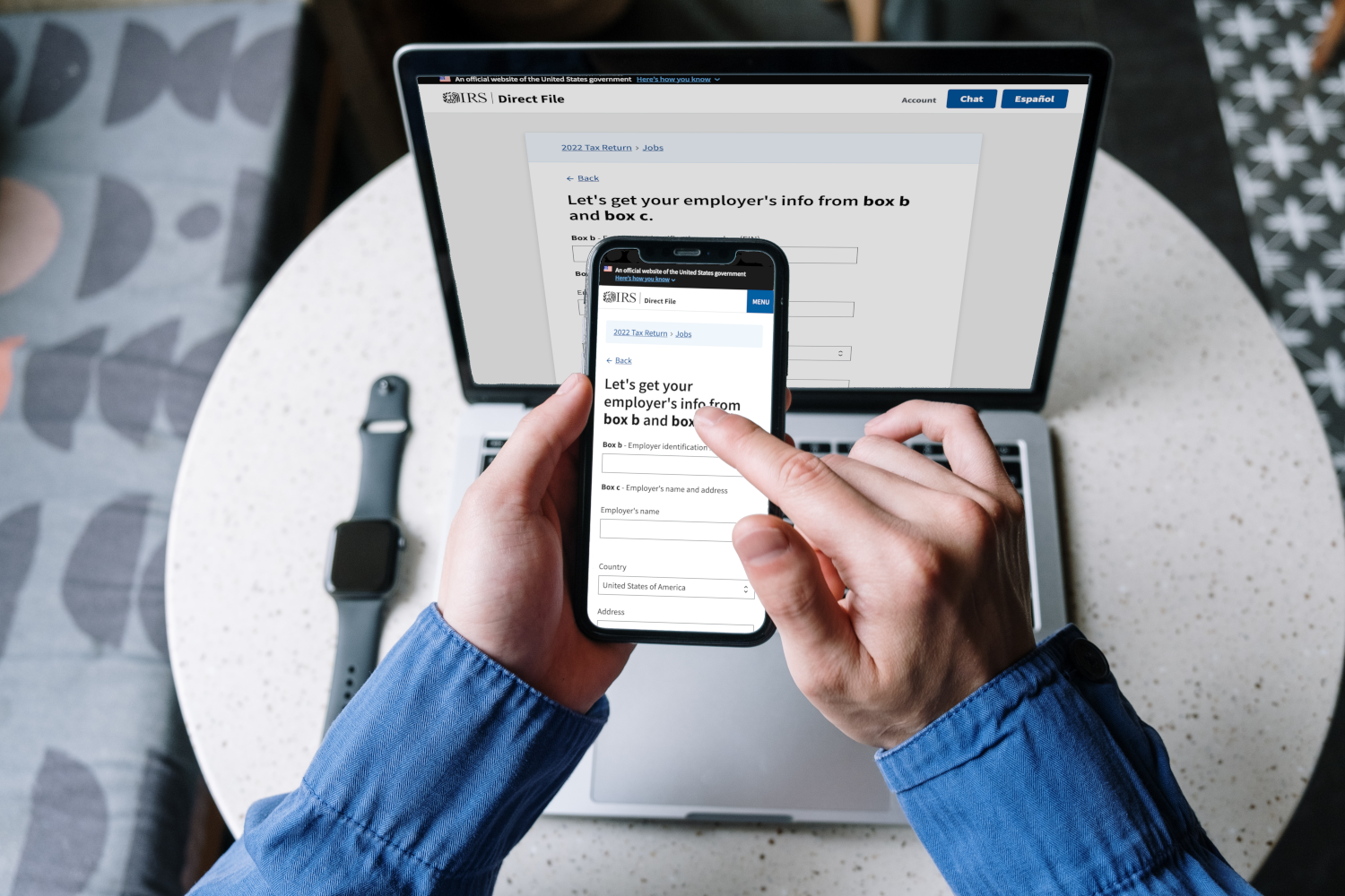
I was the principal designer for Truss (and then program manager at the IRS) to create the IRS’ free tax filing solution Direct File in a massive and extremely fast-paced delivery for the 2024 tax season. In less than a year, we turned a memo into a highly anticipated product with exemplary accessibility. The next [tax filing] year, we added more features and bumped our NPS score to +82, garnering a huge amount of praise and media attention.
Initially, while I worked at Truss, I was the lead writer in our procurement process to win this $4M contract. Once we started the project, I immediately set to lead strategy and delivery for accessibility. As our design principal, I bridged our relationship with an all-star design and research team—including USDS, 18F, and Coforma (a fellow Digital Services Coalition member)—to conceptualize, prototype, and test various experiences across the application. The following year, I moved from Truss directly to the IRS to focus more on broader organizational transformation.
Anchoring accessibility (a11y)

Management and strategy
The IRS Direct File team specifically wanted to not just meet 508 compliance, but to exceed it. When I joined, though, there was no clear anchor on this initiative, so I stepped up. I gathered all the decision-making stakeholders, presented several options (including simply meeting 508 compliance) on WCAG levels and versions, and we decided to target WCAG 2.1 AA across the board. 508 compliance requires only WCAG 2.0 (508 is a rather dated spec) with a mix of levels A and AA. We went with the (then-newest) version 2.1 and level AA across the board for a few reasons:
- It established and exceeded 508 compliance (their original goal)
- It is easy to remember the level expected of all elements (i.e. “what needs level A vs AA?”)
- It challenged us to maximize WCAG at level AAA
- It may require slighly more work than the bare minimum, but I didn’t expect anything too challenging to crop up
- It would be an outdated version before the project ended less than a year later, but once WCAG finalized v2.2, it’d be trivial to update this decision
To that last point, we were totally right. WCAG version 2.2 was finalized in pretty much the same shape as when we vetted its draft version, so three months later we revised our goal to version 2.2 — still level AA across the board. This set Direct File up to comply with the latest guidance for years to come.
Throughout the project, I developed and led our accessibility strategy, reaching and surpassing our goals in engineering, design, and research. I regularly advised on major feature decisions, in one case averting a crisis involving another vendor’s then-inaccessible software.
Finally, I organized and facilitated a working group with accessibility personnel from our pilot states—Arizona, California, Massachusetts, New York, and Washington—to coordinate our work for the first filing season:
- To share our general wisdom of accessibility concerns in tax filing
- To anticipate and proactively fix any accessibility issues in the filer experience between/across federal and state tax flows
- To help each other plan and recruit for usability testing sessions
- To better communicate (internally and externally) about the accessibility of Direct File
Collaborating with this large group of a11ies made me realize that a major challenge was the government’s love of PDFs. These notoriously inaccessible (by negligence, not inherent to the tech!) and prolific data formats are a challenge to both produce (think of the dozens of different tax forms!) and then make human-editable. This validated our early decision to make all information viewable and editable on the web form before it’s submitted—and even after, in case of rejection.
On a related topic…
Engineering
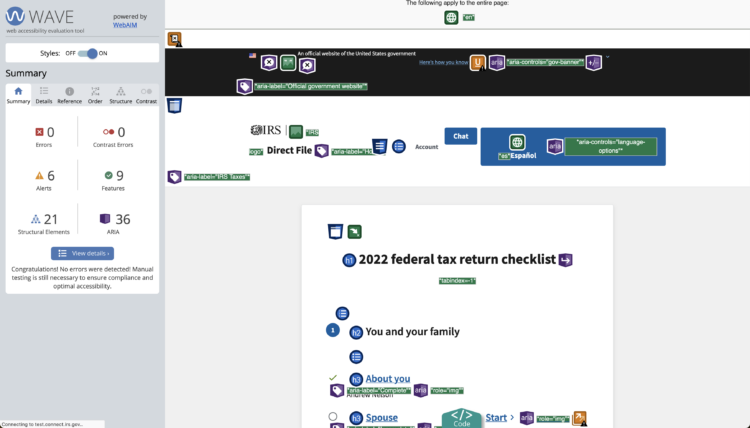
In my experience, state governments tend to have a more modern design and engineering production stack—think Figma, Usertesting.com, browserstack, and Allyant—than the federal government. A major challenge early in our strategic planning was that, due to cross-organizational, contractual, and FedRAMP timelines, we did not yet have automated end-to-end testing. It was all manual, meaning we couldn’t take advantage of pa11y, a fantastic way to get your repo constantly vetted for a11y. We also found at the time that only Deque’s axe and WebAIM’s WAVE were ready for 2.2 for manual testing, so I set about prodding pa11y and HTML_CS (which it partially relied on) to get their own software updated.
In the meantime, I created a PR template (based on Kim’s and my previous work) for engineering to reference for both accessibility matters and basic metadata. I also conducted regular trainings with engineers and designers on basic accessibility principles and how to use manual testing tools. With these together, along with constant presence in engineering chats, I was able to create a baseline expectation of good accessible code. The PR checklist was also useful for our Authority to Operate (ATO)—a critical piece of deploying code for government—in that engineers were reminded to fill out the PR templates as completely as possible to demonstrate to our ATO assessors we were delivering quality and secure software to taxpayers.
But there still needed to be explicit a11y checks. In my previous work, I preferred to be a reviewer, pull the branch to test, and only allow code to merge if it didn’t introduce any accessibility bugs. However due to this project’s ludicrous speed (many PRs per day), that was not feasible even if spread among multiple teammates. Instead, we decided to put a “needs review” label on PRs that made user-facing changes — this was also in that PR checklist. So at the end of each sprint I would invite engineers, designers, and others interested to join a web meeting as I reviewed the merged PRs. Since it was merged, we could all follow along in a shared environment using our tools, sometimes splitting the work. We’d then file bugs and remove the label from the PR, emptying the filter-based queue until the next sprint.

Research
Up to this point I had led a pod of engineers and a PM to refine and prioritize many such accessibility bugs to ensure that no critical or major bugs remained after the first three months of development. From there, we needed to do two things: test this with a broader audience and get formal endorsement from the IRS’s 508 compliance office.
First, I co-designed (with my Coforma colleague) a study specifically to get feedback from and test our prototype with people with disabilities. This was also our project’s first end-to-end study of the coded prototype, so it was a big moment! We asked participants to share their stories of filing taxes and what they would expect from a government website. We then asked them to use our prototype and give feedback along the way, finally ending with a simple summative question and reflection on their initial expectations. The results were very positive, praising our preparation and execution for assistive technology (AT) usability. They discovered only one bug, which we promptly fixed, and suggested a few more enhancements for both general and AT-specific usability, which we prioritized for our launch.
In the following months, our executive leadership (including Commissioner Werfel) and even senators shared my talking points and enthusiasm about commitment to accessibility and inclusivity. We repeated that in our presentation to the IRS 508 office—in addition to a full demo of the site using AT—who were blown away by our achievements. They had full confidence in our ability to deliver an exceptionally accessible UX for the most important public project the IRS would release that year.
In the meantime, I focused more on iterating and testing content, like explaining why someone’s submission might be rejected. This plain language work is a critical part of accessibility/508 for many reasons—comprehension, language barriers, simple usability—and something that government agencies (or any software producer) would find pays dividends in more efficient use of the product/program and lower support costs. Machine translation is not the same. Many folks need plain language even more than others: as of 2014, about one in five—or 43 million—U.S. adults had difficulty with written English to complete tasks, including about 20% with a language barrier or disability and another 20% unable to complete simple forms. In March 2024, we returned to comprehensive accessibility testing on the actual beta site. We added people who used a more diverse set of AT, including screen readers, magnifiers, Braille devices, and speech input. The results were even better this time – they all gave us an 8-out-of-10 rating.
How we continued to make it even better
At the end of our projects, one of our agile practices is to hold retrospectives. This enables all participants to reflect on their work, learn from successes and challenges, and set a course for continuous improvement. After tax season, the IRS Direct File team held a retrospective to figure out how we might continue to nurture and improve accessibility going forward. We found a lot of opportunities, including doubling the number of states we supported, importing common forms like W-2s and 1099s, and making the switch to Figma alongside the central IRS user experience team.
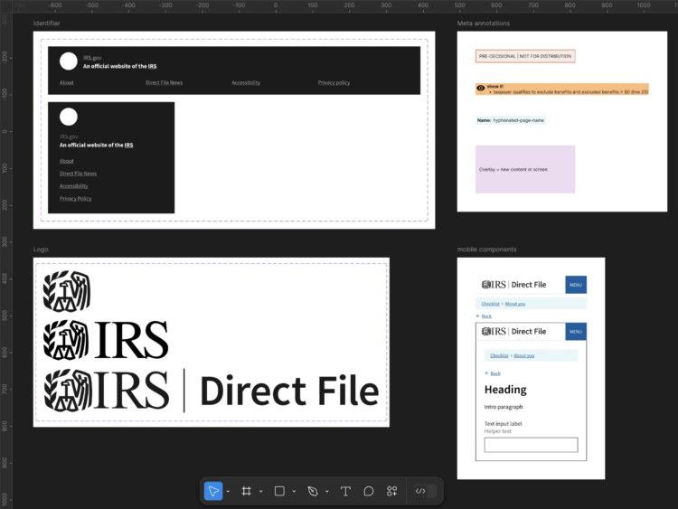
In most of these capacities, I lent design expertise as well as research, engineering, and strategy. To the latter point, near the end of our second filing season, we planned for coming iterations and tooling improvements for design, where I took initiative on our Figma adoption. I helped organize our Figma workspace, documented our practices, collaborated with more established teams, and started a component library for commonly used UI elements and annotations for engineering handoff.

Portions of this page are also reprinted in a post I wrote for Truss’ blog: https://truss.works/blog/why-irs-direct-file-is-so-accessible
